The rebranding aims to augment Fitterfly’s new and bold vision of being the first line of therapy for metabolic health
Fitterfly, a leading health-tech company working in the field of digital therapeutics (DTx), has unveiled a new brand identity as a step towards its next growth phase. The rebranding remains faithful to the company’s essence of not letting metabolic health hold people back from living an unrestricted life.
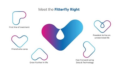
Fitterfly’s logo has transformed to stand for something more meaningful into the ‘Fitterfly Right’. It’s a smart visual play on the “F” letterform: First line of treatment; Futuristic growth for body, mind, and metabolism using data and tech; a Friend who is always there; and Freedom to live an unrestricted life. The fresh colours – pink, blue, and cyan – represent the confluence of care and technology; trust for positive health outcomes; and freedom for an unrestricted life with Fitterfly’s expertise.
The new brand video sends out the message that with Fitterfly, there is no need for anyone to let their metabolic health hold them back. It takes an optimistic and smart approach showcasing the company’s vision of futuristic growth for the body, mind, and metabolism, using data and technology. The message is – ‘Go chase your dream and live life to the fullest because, for your health, we are there!’
Speaking about this, Kanwaljeet Singh, Managing Partner and Co-founder, Fireside, “Trust credentials are extremely essential for the kind of business that Fitterfly is in. In this regard, rebranding comes as an important step in the right direction. As a young brand that aims to make a difference in people’s health, their persona needed to resonate with consumers. We are happy to back them at every step.”
Speaking about the new identity, Dr Reshma Mallya, VP – Marketing & Communications, Fitterfly, said, “We want Fitterfly to be a brand that is credible and positive; an endearing brand they turn to for the right guidance to live their healthiest lives. That was the purpose of our rebranding exercise. We are excited with what we have launched.”
Adding further, Vani Dandia Gupta, Founder, Cherry Peach Plum Branding Solutions, said, “Fitterfly’s new identity is more in line with their huge scale of ambition. We worked together to arrive at the right proposition after doing consumer research and defining what the new brand identity must communicate. There are many different meanings to our new logo, it is distinctive and bold, and lends itself to many different uses across media.”
Shalini Singh, Founder, Candy Shop Communications, said, “For Fitterfly, we wanted to create a brand persona that represents the qualities of the brand – from being a caregiver to an expert that can be trusted. We are delighted to have hit upon the idea of ‘Fitterfly Right’. A single icon that depicts so many qualities and has endless possibilities. With gradients gaining momentum, the colours are carefully selected to depict the qualities of care and trust. The rebranding will cement the company’s position as a brand with the rock-solid mission of bringing about a transformation.”